Brand Guidelines + Methodology

Our story

Our story brings our brand to life.

Pedragosa Padel Club is rooted in the spirit of the Algarve. The club sits among vineyards, warm light, and open landscape, reflecting the calm and confident energy of the region. We roll with a culture that values community, trusted friendships, and an active lifestyle that feels good from the inside out. Our sister property, Quinta da Pedragosa, adds depth with its vineyard, magnificent wines, and countryside setting. Together they form a neighborhood where play, wellness, and hospitality live naturally side by side.

Pedragosa Padel Club is a place to play, connect, and unwind.

Play well. Live well.

Who we are

Pedragosa Padel Club is built for people who enjoy all levels of game play, good company, and an easy sensibility.

The vibe is relaxed and welcoming. New players blend in quickly, conversations happen easily, and regulars create an atmosphere that feels genuine and open. The club brings together quality courts, skilled coaching, and social spaces designed for comfort and connection.

The wellness center, gym, and boutique hotel allow guests to turn a match into a full Algarve escape.

How we roll

We focus on clarity, comfort, and a smooth flow from start to finish.

We invest in top quality courts, strong coaching, and smart technology that keeps the experience simple and intuitive. Lighting, scoring, booking, and social areas work together so players can stay fully present. Every detail is shaped with intention. Visitors feel appreciated. Relaxed. Delighted.

Our surrounding vineyards, wellness and hospitality offerings create a lifestyle that values balance, nature, and a grounded sense of wellbeing.

Our vibe

We speak with confidence, warmth, and intelligence.

Our tone is modern, clear, and free from unnecessary clutter.

We value sincerity, ease, and a sense of fair play. 

Our sound

Authoritative
We speak with experience, and we keep it real.

Welcoming
Our tone invites people in. Direct, friendly, and open.

Reliable
We say what we mean and follow through.

Chill
Natural, human, and clear.

Tenacious
We keep standards high and the club running smooth.

Admiring
We respect effort and progress and acknowledge both with intention.

75-word blurb

Pedragosa Padel Club is a place to play, connect, and unwind. The club sits beside our sister vineyard, Quinta da Pedragosa, in a quiet Algarve valley shaped by sunlight and open space. We roll with a culture that blends good game play, honest hospitality, and easy outdoor living. Top quality courts, strong coaching, a restaurant, a pro shop, a wellness center, and a boutique hotel come together to create a lifestyle that feels relaxed, social, and naturally balanced.

50-word blurb

Pedragosa Padel Club is a place to play, connect, and unwind. Next to Quinta da Pedragosa, the club brings together the game, great food, quality gear, and the relaxed feel of the Algarve. With strong coaching, a restaurant, a pro shop, and inviting social spaces, it reflects a calm and modern lifestyle.

25-word blurb

Pedragosa Padel Club is a place to play, connect, and unwind, offering courts, coaching, dining, and gear in a relaxed Algarve setting that brings people together with ease.

Algarve life

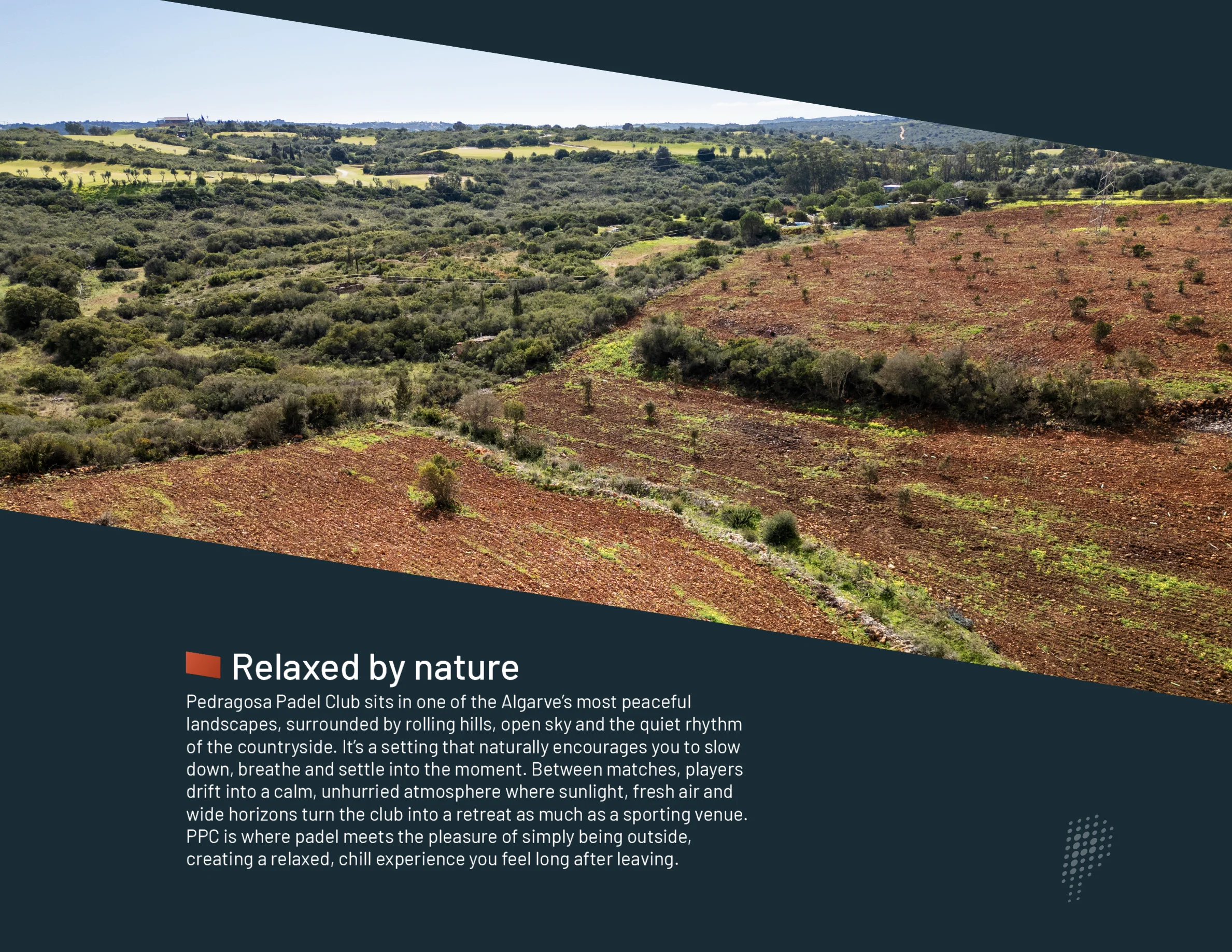
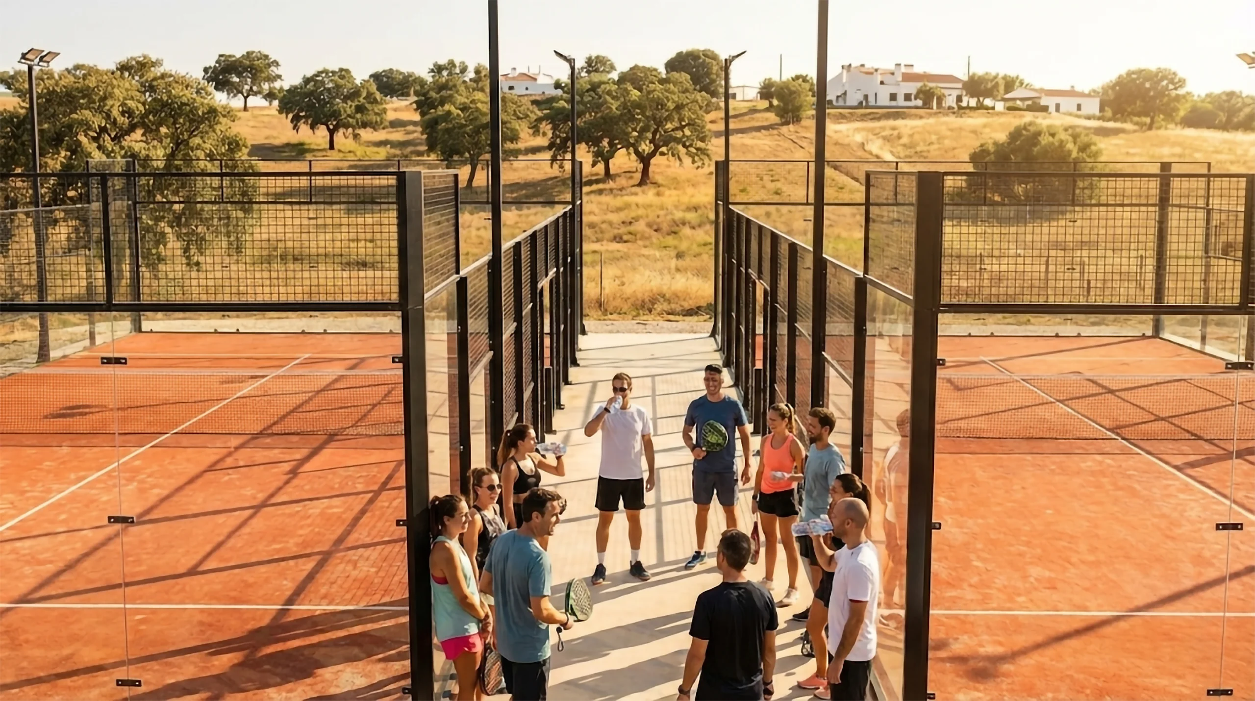
The Algarve is known for warm light, open landscapes, and a pace that feels easy and refreshing. The region invites people to live outdoors, breathe clean air, and enjoy simple pleasures.

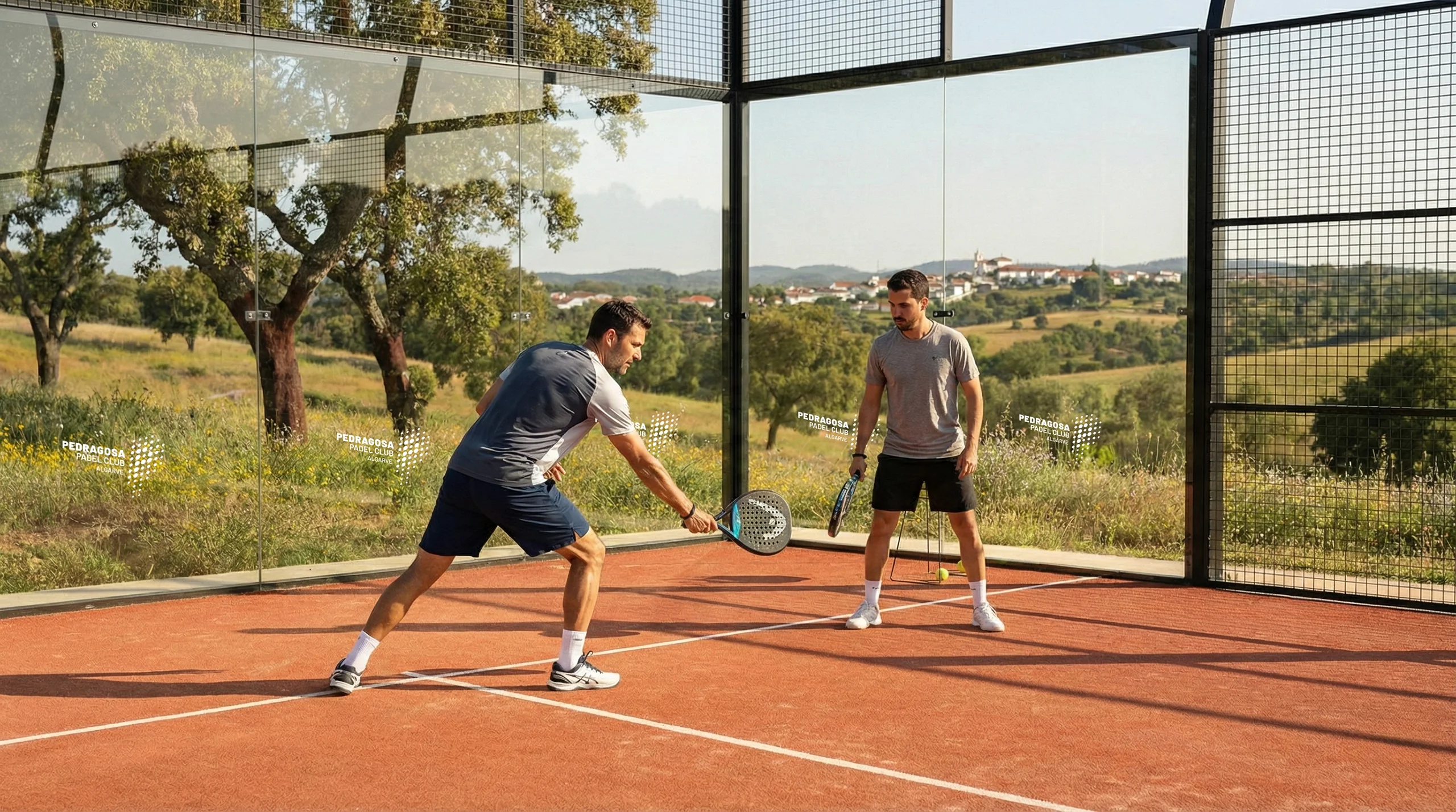
Pedragosa Padel Club sits among vineyards and rolling hills, yet it is close to some of the Algarve’s most iconic beaches. The coastline offers golden cliffs, stunning geography, soft sand, and surf villages with cafés and a cool, ocean-forward culture.

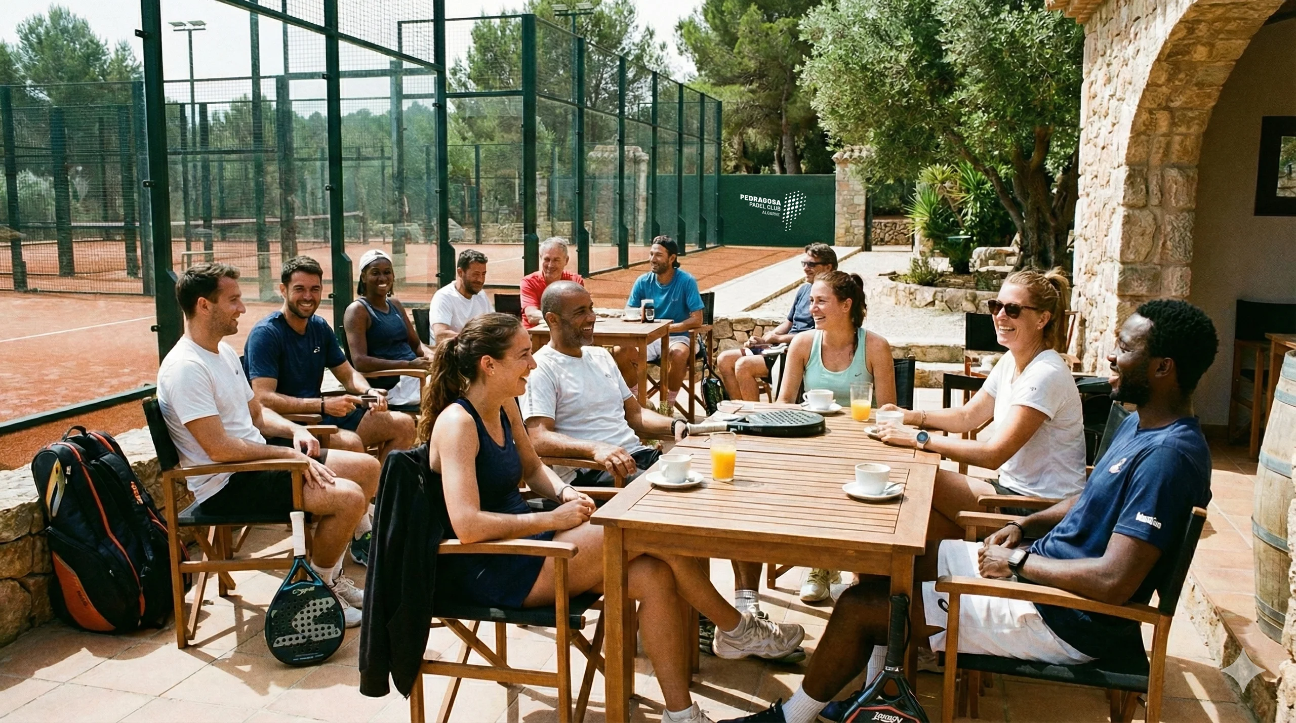
The mix of countryside and coastline creates a lifestyle that is active, grounded, and deeply satisfying. A morning on the court, an afternoon by the sea, and a walk through the vineyards at sunset fit naturally into a day.

Managing our brand’s identity

Say hello to our logo

Our logo is the most immediate representation of our company and products. To maintain the consistency of the brand, all logo guidelines should be followed, and the logo should never be altered in any way.

Logo variations

FULL COLOR ORANGE AND GREEN

As the most forward-facing element of our brand, our primary logo should be used on our branded collateral whenever possible. To maintain the consistency of the brand, all logo guidelines should be followed, and the logo should never be altered in any way.

BLACK

When printing restrictions prevent us from using our full color or knockout versions of the logo, this black version can be used.

GOLD

When printing restrictions prevent us from using our full color or knockout versions of the logo, this black version can be used.

SILVER

When printing restrictions prevent us from using our full color or knockout versions of the logo, this black version can be used.

BRONZE

When printing restrictions prevent us from using our full color or knockout versions of the logo, this black version can be used.

KNOCKOUT

When used over colors or images that are too dark for our ‘Black’ logo to be legible, we use this knockout version.

LOGO TYPE ONLY

While ‘Full Color Black and Red’ is our primary logo and should be utilized whenever possible, the ‘Full Color White and Red’ alternative version can be used at the discretion of the designer.

Logo usage

CLEAR SPACE

To preserve the integrity of the logo, always maintain the specified minimum clear space, which insulates our logo from distracting visual elements, such as other logos, copy, illustrations, or photography.

SIZE

Ensure the logo is reproduced in a legible size and that it does not appear subordinate to any other partner logos included on the creative executions.

Similarly, do not present the logo in a way that makes it the most distinctive or prominent feature of what you’re creating.

MAINTAINING SHAPE AND PROPORTIONS

To ensure accurate and consistent use, never alter, rotate, embellish, or attempt to recreate the logo. The proportions and shape of the PEDRAGOSA logo should never be altered for any reason. To resize, hold the “Shift” key in most software programs to maintain the proportions while scaling up or down. Always maintain the minimum clear space, even when proportionally scaling the logo.

COLORS

Do not modify the colors in our primary logo. If you are unable to use the correct colors, the monochromatic logo should be used.

Color palette

PRIMARY LOGO COLORS

Hex #8AC033, RGB (138,192,51)

Hex #E04B28, RGB (224,75,40)

Pedragosa Padel Club colors come in 5 broad flavors.

The first flavor, Primary Logo Colors, is locked down and should never be changed. The remaining flavors, Secondary Neutral, Blue Gray, Warm, and Cool colors are shown here as a general guide but do not have to be followed as strictly.

However, the Pedragosa Padel Club color palette should always remain bold. Avoid pastel tones, or other colors that tend to muddy the palette.

SECONDARY NEUTRAL COLORS

Hex #265CAA, RGB (38,92,170)

Hex #001C28, RGB (0,28,40)

Hex #78828D, RGB (120,130,141)

GRADIENT COLORS

Hex #CED4D8, RGB (206,212,216) - #7A848C, RGB 122,132,140)

Hex #D3B773, RGB (211,183,115) - #B29433, RGB (178,148,51)

Hex #957A47, RGB (149,122,71) - #5F4400, RGB (95,68,0)

Typography

Barlow Light

Aa

A B C D E F G H I J K L M N O P Q R S T U V W X Y Z
a b c d e f g h i j k l m n o p q r s t u v w x y z

Barlow Regular

Aa

A B C D E F G H I J K L M N O P Q R S T U V W X Y Z
a b c d e f g h i j k l m n o p q r s t u v w x y z

Barlow Bold

Aa

A B C D E F G H I J K L M N O P Q R S T U V W X Y Z
a b c d e f g h i j k l m n o p q r s t u v w x y z

Barlow Black

Aa

A B C D E F G H I J K L M N O P Q R S T U V W X Y Z
a b c d e f g h i j k l m n o p q r s t u v w x y z

80px

Heading 1

68px

Heading 2

54px

Heading 3

40px

Heading 4

32px
Heading 5
18px
Heading 6

18px

Paragraph

About Barlow

“Barlow is a slightly rounded, low-contrast, grotesque font type. Drawing from the visual style of the California public, Barlow shares qualities with the state’s car plates, highway signs, busses, and trains.

This is the Normal family, which is part of the superfamily along with Semi Condensed and Condensed, each with 9 weights in Roman and Italic.

The Barlow project is led by Jeremy Tribby, a designer based in San Francisco, USA. To contribute, see github.com/jpt/barlow” https://fonts.google.com/specimen/Barlow

Paragraph styles

To maintain visual consistency in our presentation of text, we have designed a few primary type sets, which are outlined on the right.

Large headlines in Barlow Semi-Bold

Supporting subheader in Barlow Semi-Bold

Supporting text and small body copy in Barlow Regular. Lorem ipsum dolor sit amet, consectetur adipiscing elit, sed do eiusmod tempor incididunt ut labore et dolore.

TITLE IN BARLOW SEMI-BOLD UPPERCASE

Large headlines in Barlow Semi-Bold

Supporting text and small body copy in Barlow Regular. Lorem ipsum dolor sit amet, consectetur adipiscing elit, sed do eiusmod tempor incididunt ut labore et dolore.

CALLOUT TEXT IN BARLOW SEMI-BOLD UPPERCASE

Supporting text and small body copy in Barlow Regular. Lorem ipsum dolor sit amet, consectetur adipiscing elit, sed do eiusmod tempor incididunt ut labore et dolore.

Graphic Elements

We must understand what drives us and communicate it clearly.

We are guided by connection, excellence, and the joy of shared experience. Every decision reflects these principles, from on-court operations to events, partnerships, and community outreach. We believe that innovation and care go hand in hand, and that thoughtful technology can strengthen the sense of belonging that defines Pedragosa. When we invest in improvement, we invest in delight, the feeling that every player, visitor, and member is valued and understood.

The Smash

The Smash was created to mirror our logo’s energy, illustrating the ball’s trajectory as it’s struck by the racket. It functions as a key graphic device to introduce high-priority headlines and also serves as a versatile design motif that enhances imagery across various applications. 

When used on its own, it should appear only in the approved colors and gradients shown below.

Using the Smash

The smash can be used to mask images in many different ways, the most important thing to keep in mind when using it is to keep the 9 degree angle intact.

The Logo Mark

The PPC logo mark is the core visual symbol of the brand, representing: the letter P in Pedragosa Padel Club, a padel racket, precision, movement, and the premium standard that defines Pedragosa Padel Club. Its simplicity and strength allow it to scale effortlessly across all applications while remaining instantly recognizable. 

The mark functions as a versatile asset that reinforces brand authority whether displayed boldly or used with subtlety. It can be deployed as a watermark on photography to signal ownership and professionalism, printed on apparel to create a cohesive team identity, integrated into padel court areas to elevate the on-court experience, applied to signage for maximum visibility, and placed on vehicles to extend brand presence into the wider community. 

The consistency and clarity of the PPC logo mark across all touchpoints strengthens trust, communicates quality, and unifies the entire brand ecosystem.

Pedragosa Padel Club

Using the Logo Mark

The mark can be used to accentuate or water mark images in many different ways, the most important thing to keep in mind when using it is to keep most of the mark visible. It should not be used on backgrounds with high contrast making it difficult to see the mark dots.

  • The mark should always appear in one of the brand colors at a time (not mixed colors).
  • It can however, appear as a gradient in one of the brand gradients. 
  • The mark can appear with a slight amount, or a significant amount of transparency depending on the application.
  • In all cases the mark should be clearly visible.

Lifestyle photography

COMPOSITION
  • Layered depth of focus
  • Subject can be off-center
  • Scenes/backgrounds are asymmetrical
  • Allow room for copy to the left or right
TREATMENT
  • Bright, rich color palette
  • Avoid images with high contrast
  • Avoid images with large white areas
  • Use overlays when needed to improve copy legibility
  • Brand images with translucent red rectangles and translucent white stroke rectangles, but not for every image. Always keep the Pedragosa Padel Club logo angle intact
ETHOS
  • Subjects are engaged in real life experiences
  • Subjects may break the 4th wall, but infrequently
  • Avoid images with overly dark, foreboding tones
  • The mood is inspiring, sometimes whimsical, always evoking trust
Scroll to Top